Quit Vaping Infographic
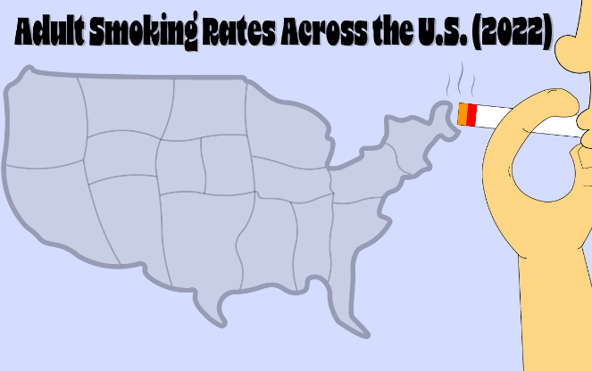
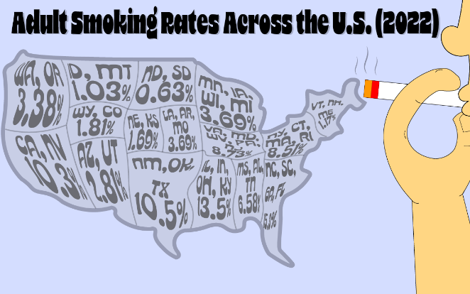
I wanted to create an infographic that promotes quitting smoking while directing it towards vape users. I first found the Dataset below and went for showing the data with a smoke cloud created by a cigarette, the states would be show the percentage of how many current smokers there were for the year 2022.
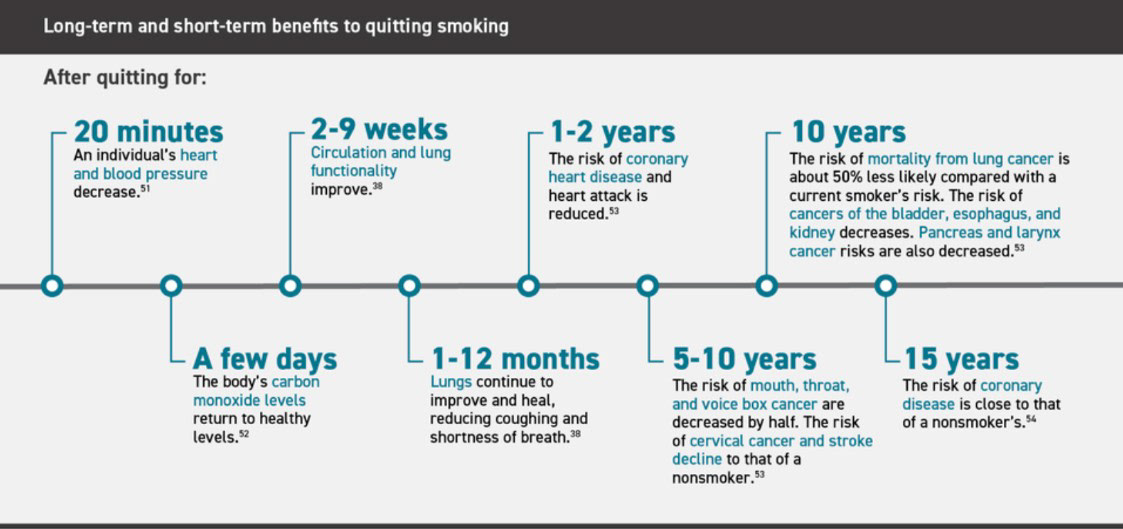
After I placed the datapoints in, I realized it was hard to read and a bit messy. I then went back to research and found a new dataset more relevant to vaping. The dataset below shows what happens to your body progressively as you quit vaping.
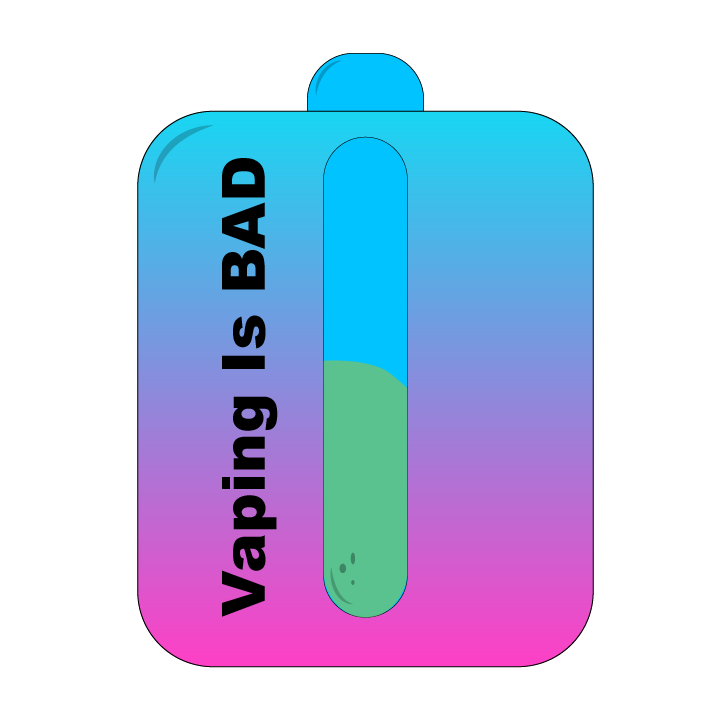
From here I decided I wanted to use a vape device and its juice to show the progression of quitting.
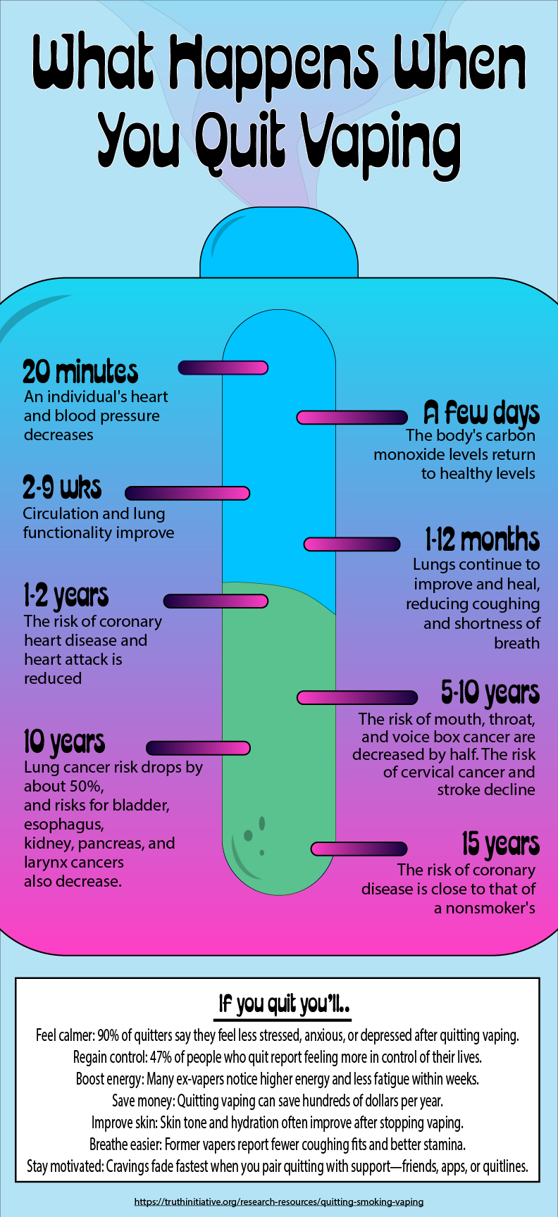
This is the final piece, I wanted it to feel like a poster you would see in a Doctors Office, trying to use vibrant colors to grab the eye from a far. I used the font Acid Green Poster for the titles and subtitles and used Myriad Pro for the paragraph text.