
Aaron McGhee Senior Capstone Mental Health America Process
Project Overview
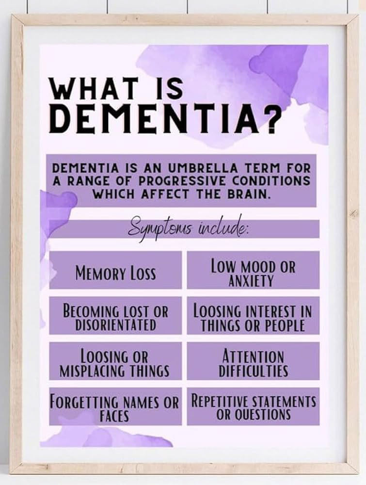
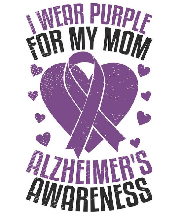
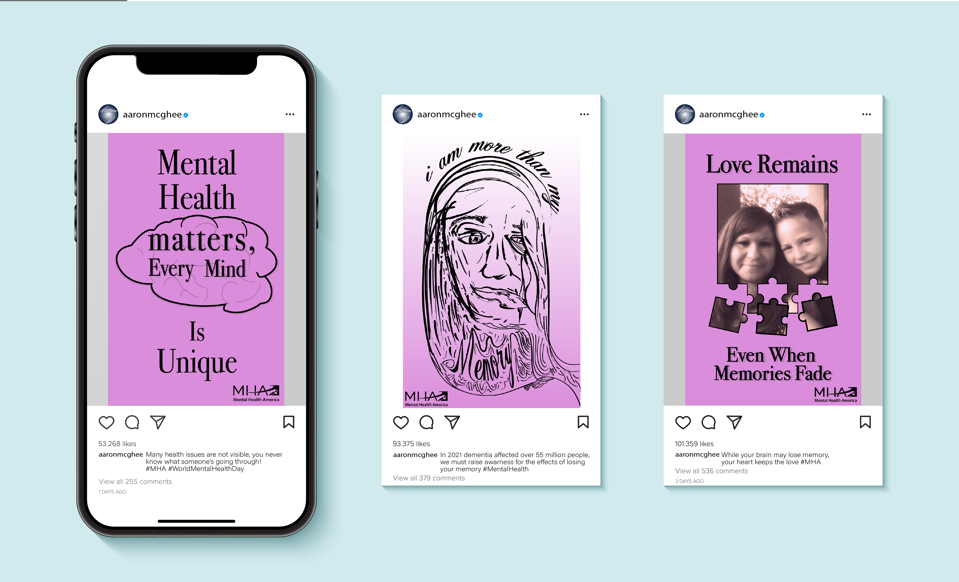
For my senior capstone project, I created a series of three posters for Mental Health America, focusing on memory loss and the deterioration of the mind. This project is deeply personal; my mother was diagnosed with dementia in 2021, which has profoundly affected my family and me. Through this work, I wanted to raise awareness about dementia in a way that highlights empathy and understanding rather than just statistics or facts.
My mother inspired the direction of this project. When I asked her what she wished people understood better, she said, “People need to be more patient.”
That statement became the emotional foundation of my campaign. A reminder that those affected by dementia are trying their best, and we can help by being patient and compassionate.
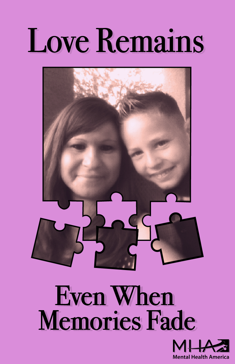
I used the color purple, the official color of Alzheimer’s awareness, and included a personal photo of my mother and me to anchor the work in authenticity and emotional truth.
Research & Inspiration
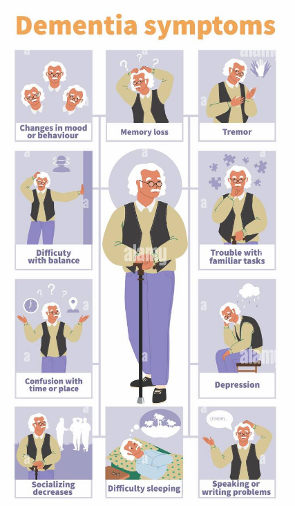
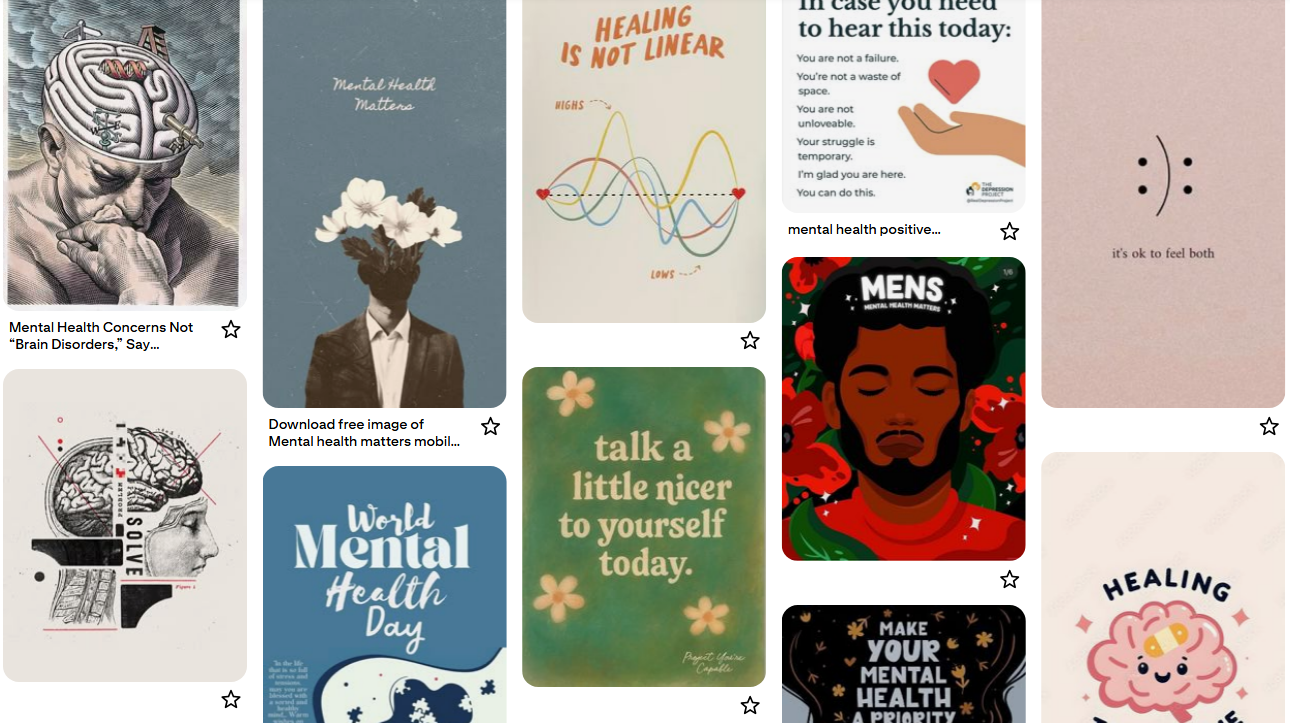
Before I began designing, I explored existing campaigns from organizations such as the Alzheimer’s Association and Mental Health America. I noticed many relied heavily on clinical imagery and data, while I wanted to communicate emotion, memory, and identity in a softer, more human way.
My Pinterest mood board served as a foundation for my visual direction.
Mood board Themes:
• Muted purples, soft pinks, and neutrals to convey calmness and remembrance
• Imagery of puzzle pieces, fading photographs, and overlapping silhouettes
• Minimalist poster layouts emphasizing white space and balance
• Gentle typography with emotional warmth
Ideation & Thumbnails
To explore my ideas, I began sketching possible metaphors for memory loss. Although much of my process occurred digitally in Illustrator, I revisited physical sketching to visualize layout and concept variations.
Early Concept Directions:
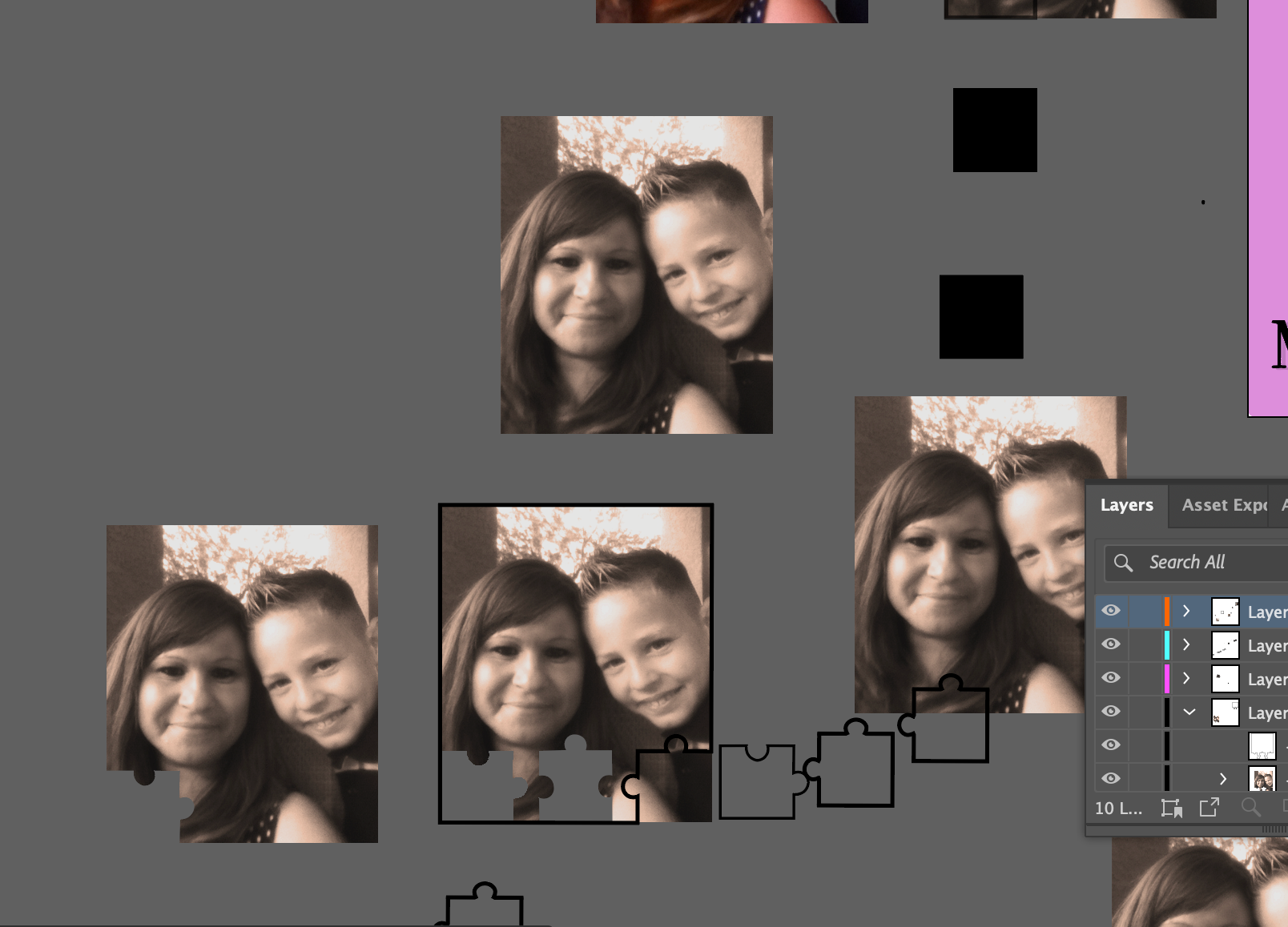
• Puzzle Pieces — representing fragments of thought and fading memory
• Fading Portraits — illustrating how identity and clarity blur over time
• Disappearing Text — symbolizing forgotten words and fading communication
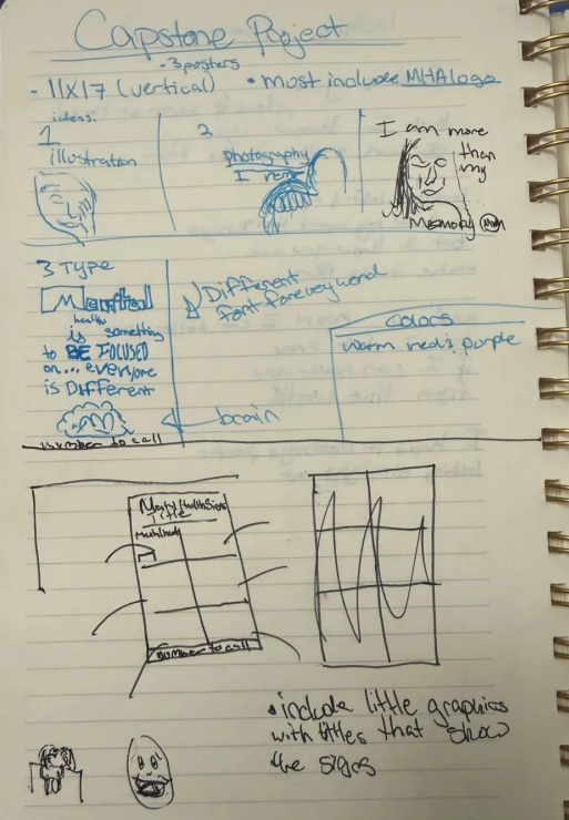
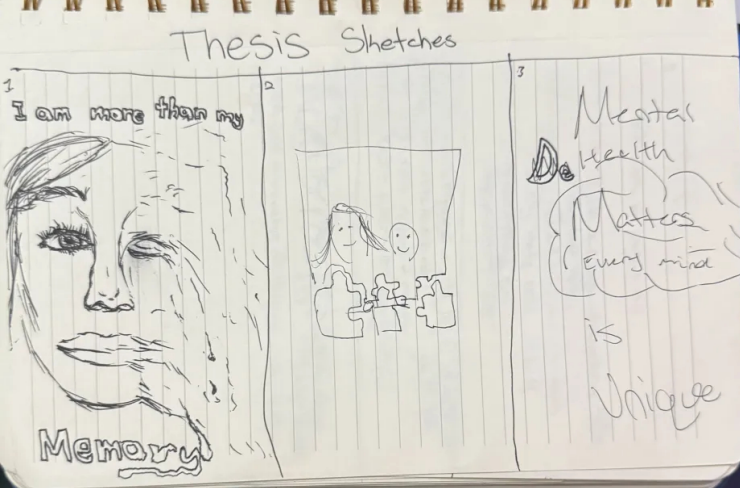
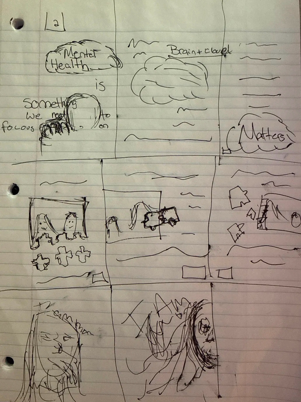
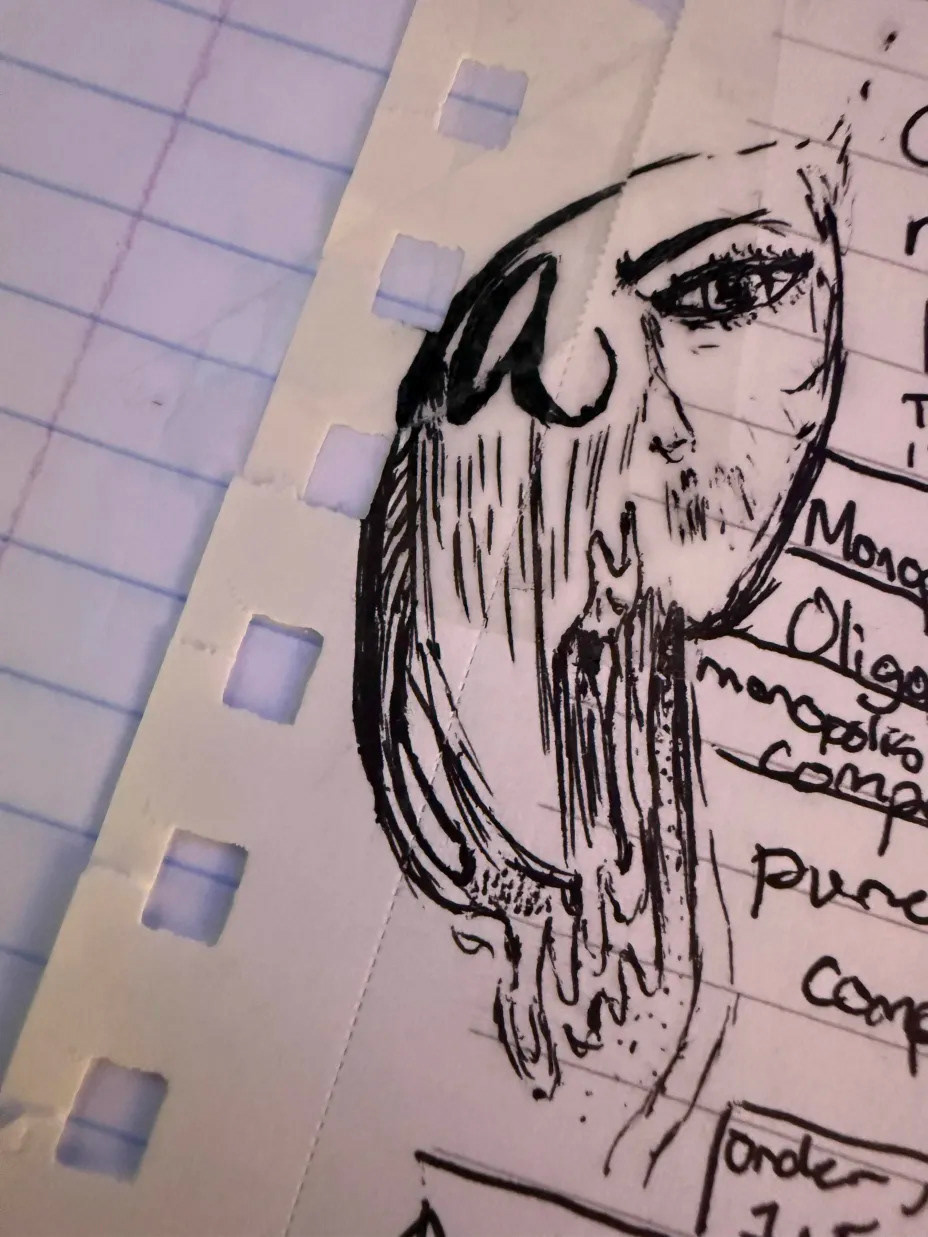
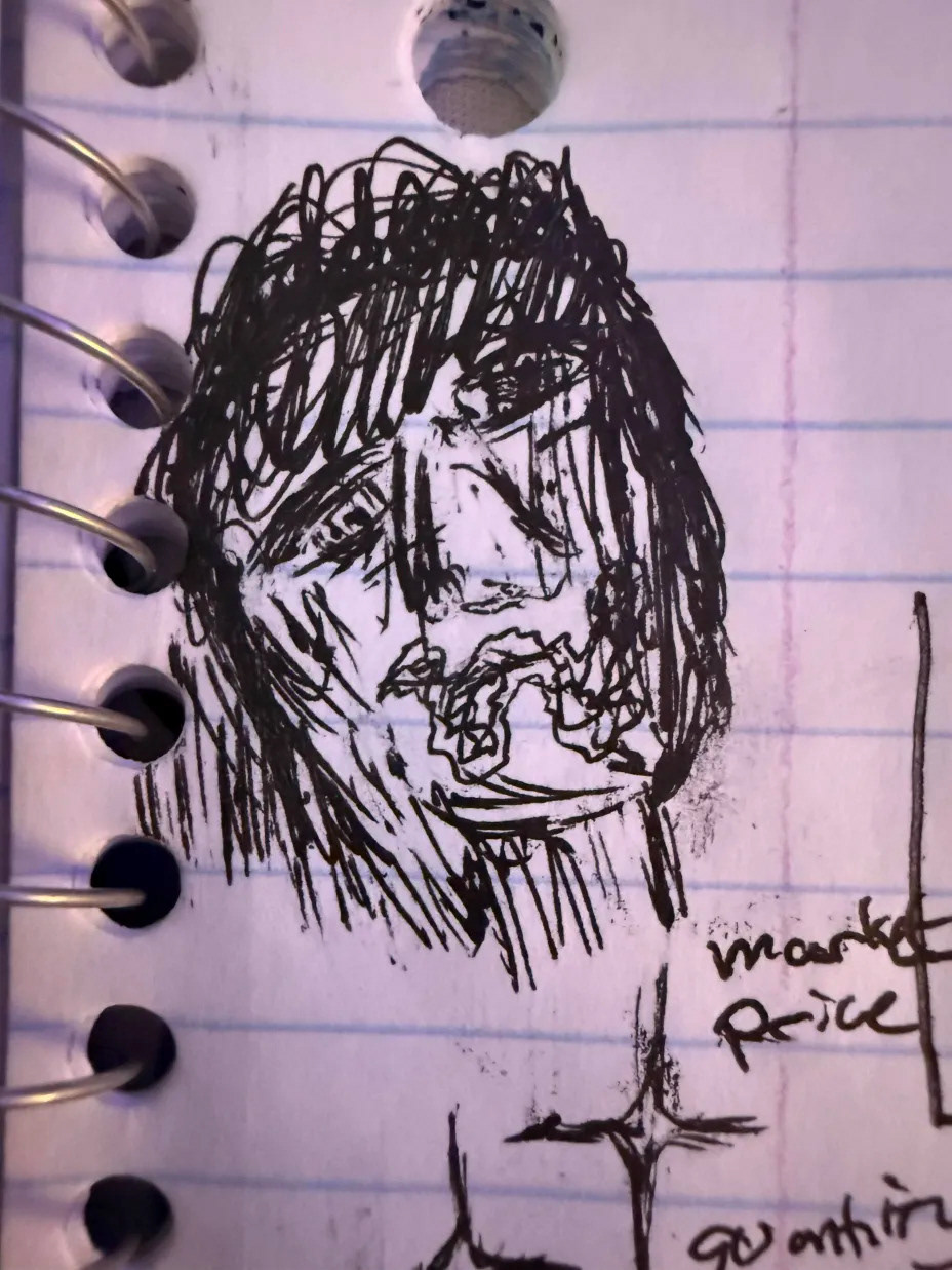
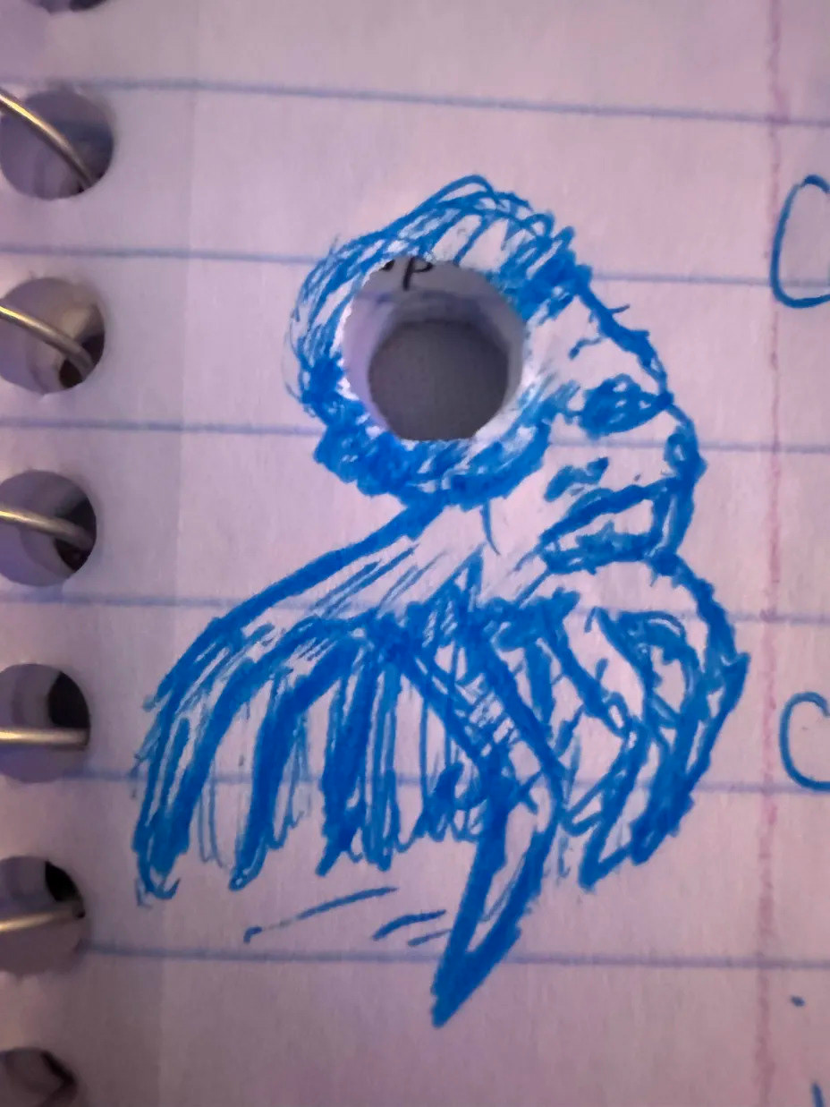
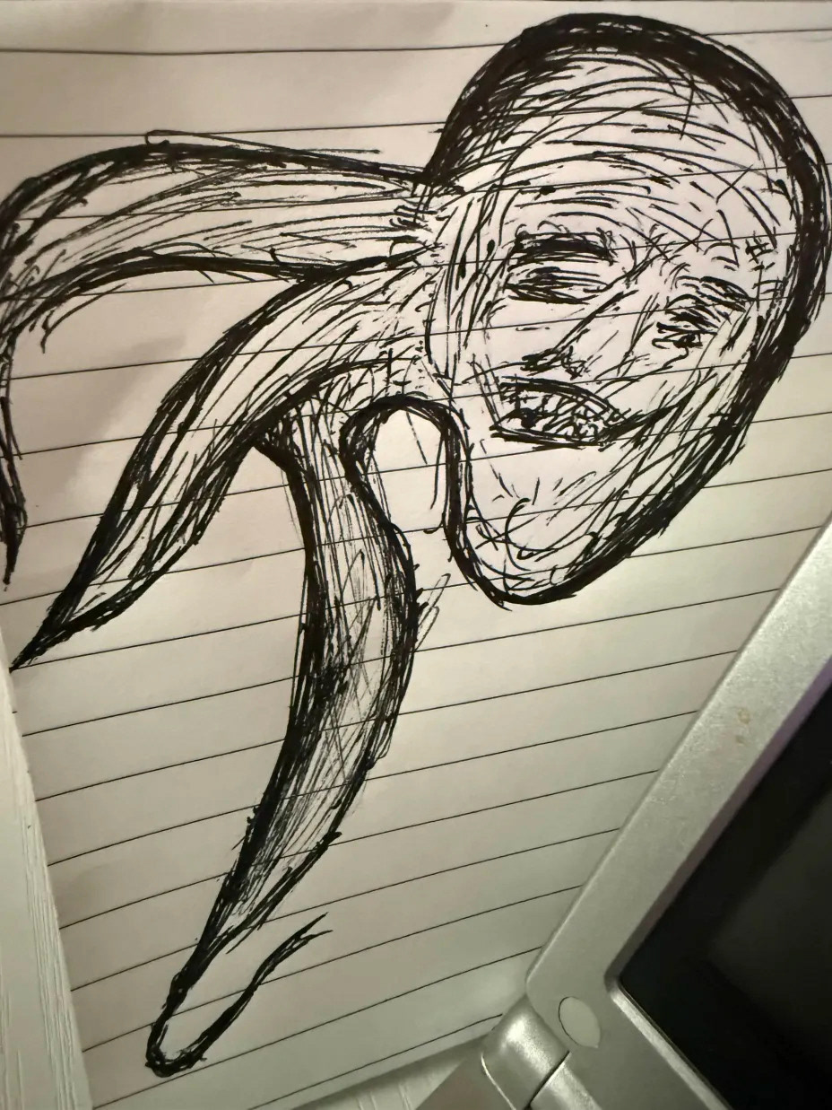
These sketches helped me identify which metaphors communicated empathy most effectively. I ultimately selected the puzzle-piece concept because it visually represents both loss and connection — the idea that even as pieces fade, there’s still beauty and meaning in what remains.
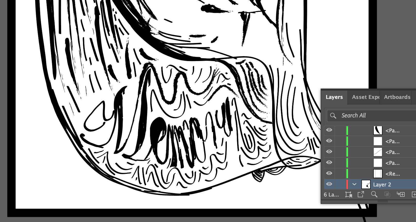
Most of my iterative exploration happened within Illustrator. I tested multiple compositions, color palettes, and typographic arrangements before reaching my final set.
Iteration Highlights:
• Experimented with different shades of purple to find one that balanced vibrancy and warmth.
• Tested three different typefaces (Bodoni, AcroterionJF, and humanist). I later decided a unified type family would make the set feel more cohesive.
• Adjusted puzzle-piece outlines several times, testing both filled and stroked shapes for readability.
• Explored layering effects to simulate fading or fragmented memory.
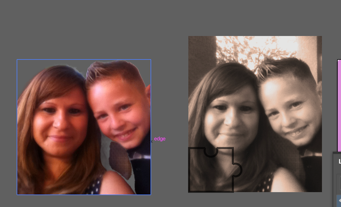
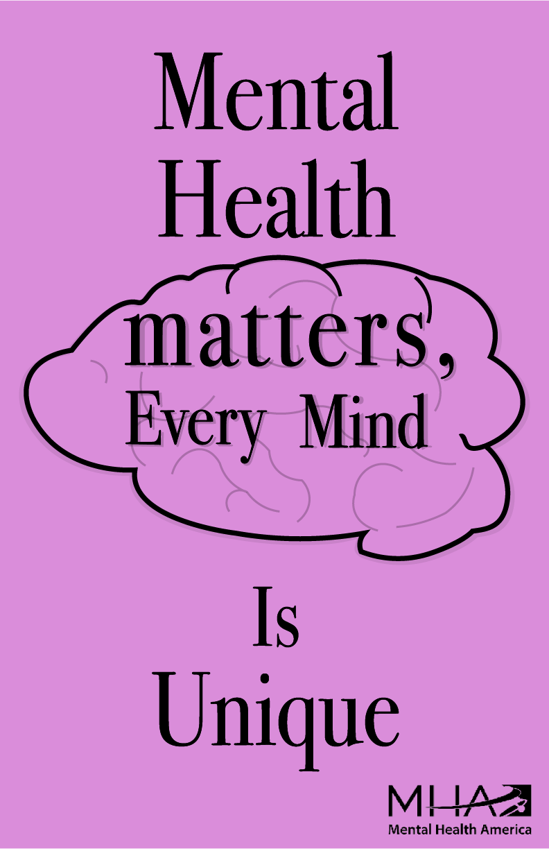
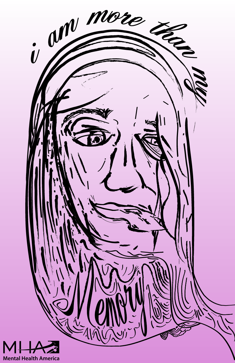
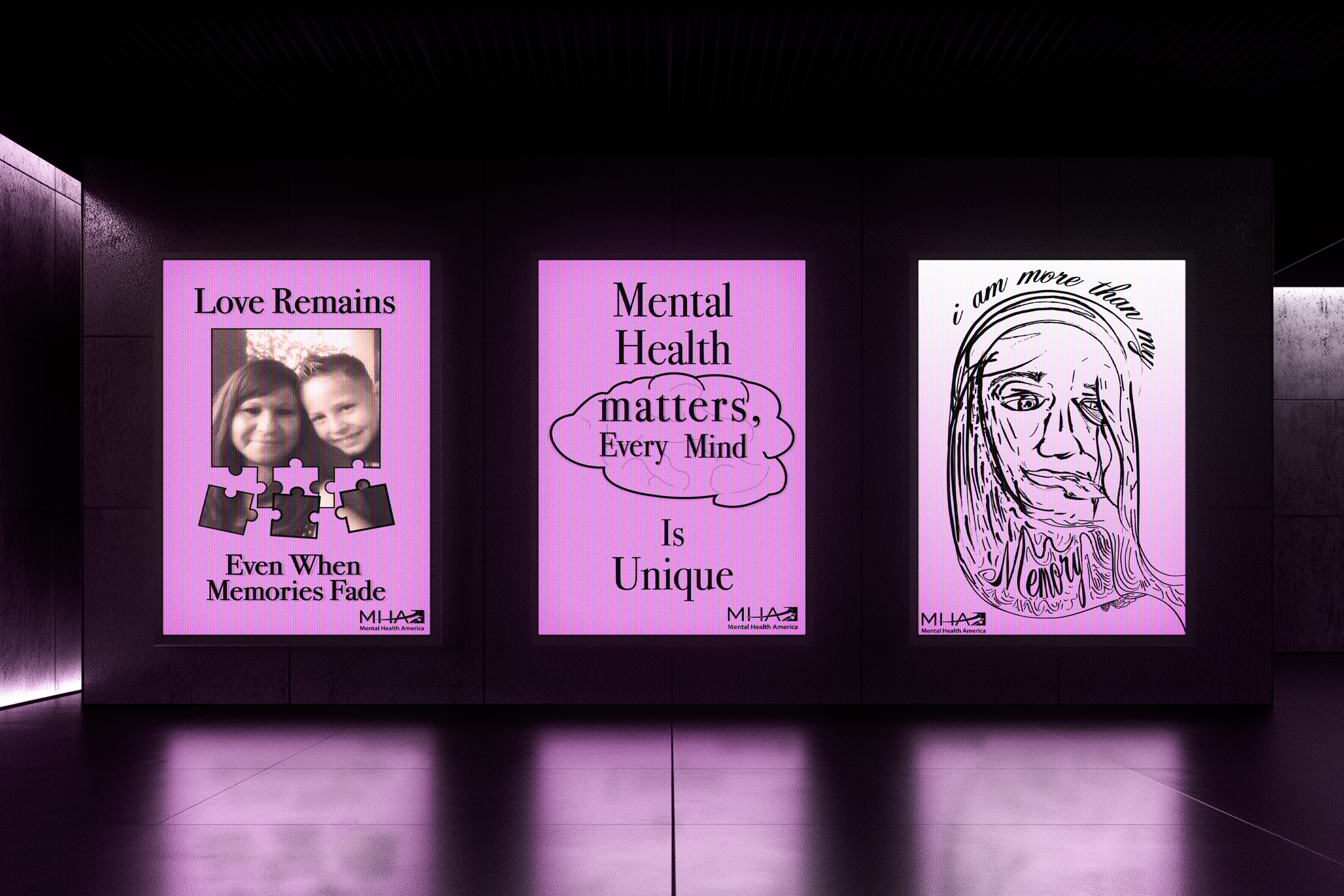
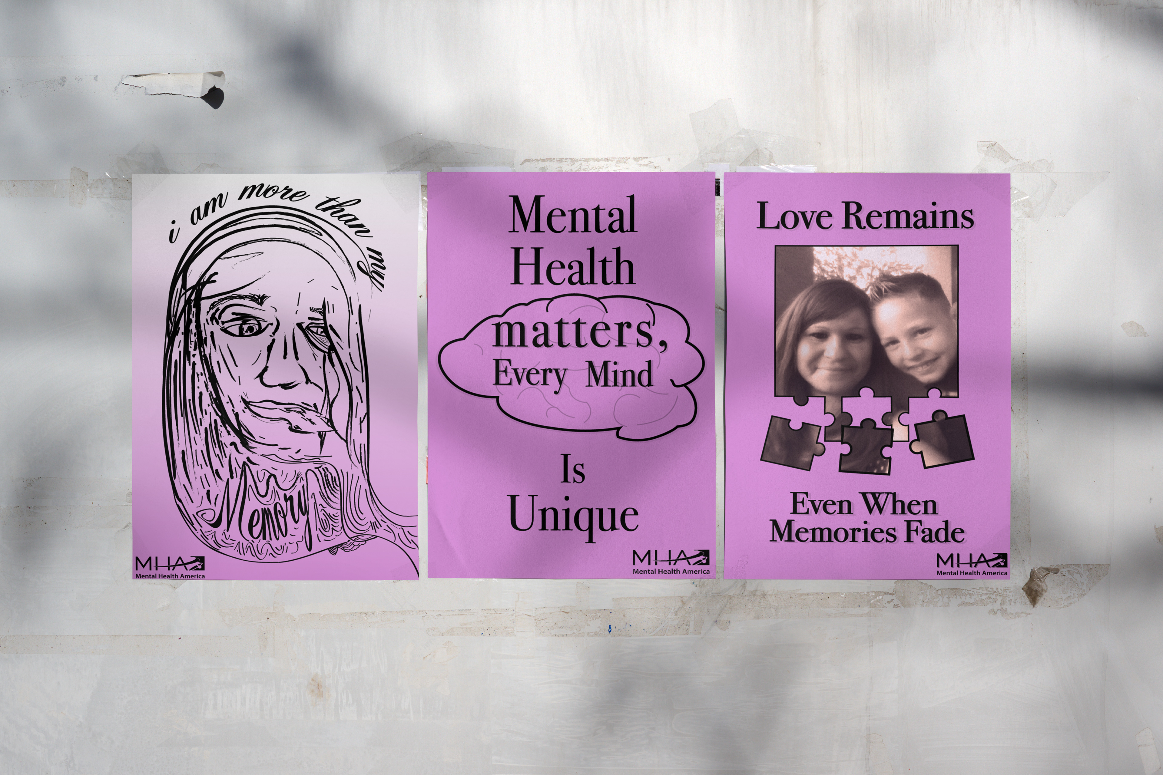
Final Poster Series
Each poster addresses a different emotional aspect of dementia — memory, identity, and empathy — while maintaining a unified aesthetic.
Design Cohesion:
• Unified purple hue across all three posters
• Consistent typography and layout grid
• Subtle texture to evoke a fading sense of memory
• Inclusion of personal imagery for emotional grounding
Technical Revisions Based on Feedback
After receiving critique, I made several refinements to improve visual consistency and technical quality:
• Standardized the purple hue to maintain color cohesion across the set
• Selected two typeface families for all three posters
• Removed uneven black outlines around puzzle pieces
• Adjusted borders and text alignment for balance and clarity
• These refinements helped the series feel cohesive as a professional campaign rather than three separate designs
Reflection
This project challenged me to strike a balance between personal storytelling and visual clarity. I learned how design can translate emotion into communication — how something deeply personal can connect universally through empathy, no matter how difficult the subject is.
The biggest takeaway was understanding the value of process documentation. While my creative development often happens digitally, I’ve learned to show my iterative steps through sketches, screenshots, and exploration. This transparency demonstrates problem-solving and strengthens the final narrative of my work.
Moving forward, I’ll continue refining my technical craft while keeping emotional authenticity at the heart of my design process.